In the past month, our team has deliberately worked on creating the best most efficient version of UNLAX , an online guide for university students finding their best study spaces. Our aim was to give out a selection of study spaces to our viewers after reviewing study places personally regarding different factors such as pricing and facilities.
We decided to use the most out-reachable platforms for our project, social media and Youtube. We have also published our reviews on google maps for the public whom are looking into our reviewed study locations.Our team member Gio would take amazing firsthand photographs and videos for our reviews. Below are our pages.
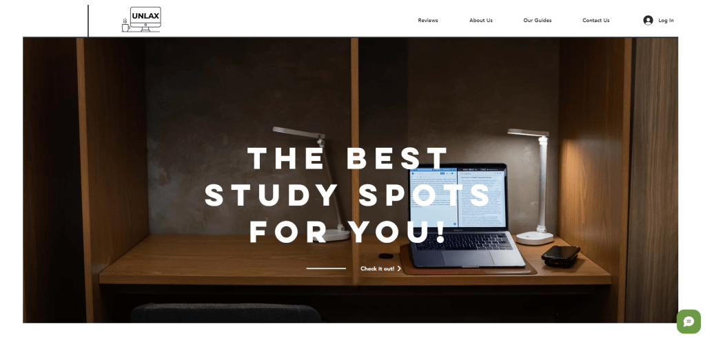
UNLAX website

reviews
We made quite some changes to further appeal to our audience and create better versions of our reviews. Initially, we had not one nor two but 4 different platform to showcase our work. It was a headache and extremely hard to handle, the work added on our teams shoulders was immense so we decided to cut off twitter and focus more on our website and Instagram. We kept our Youtube channel but just to post our videos. Our main focus shifted on Instagram and our website.
Our instagram followers were way more than Youtube, twitter and the website combined so focusing on the content there was naturally a better decision. Our first reviews was very long, it was about 4 minutes long, no one nowadays wants to watch such long videos. so we thought of shortening our videos to at most 40 seconds long. we soon realised adding captions regarding the important details of the location within the video would be more effective than writing lengthy captions for each posts. Thus, we shifted to doing that instead.
Our Instagram page was more active and engaging with our viewers than before, we received good comments and private texts about how useful our page was. Students left comments and visited those study spaces after we praised them.


The biggest and most proud change we made was by changing our logo. below is our new and a much clearer logo.
Our old logo had a message we as a team understood but our viewers couldn’t grasp it. Therefore, we redesigned it to better suit our project and give the best first impression to our viewers. Our new logo is quite simple but very productive. Do you agree?
We started showing our new logo in all of our posts and videos to enhance its appearance towards our viewers.
Personally, I did this blog in one of our recommended study spaces, I love it here and have found myself great deals researching study spaces.
here is our beta project link : https://www.youtube.com/watch?v=DKIBqbm5kY8

Leave a comment